Create a responsive website - few easy steps
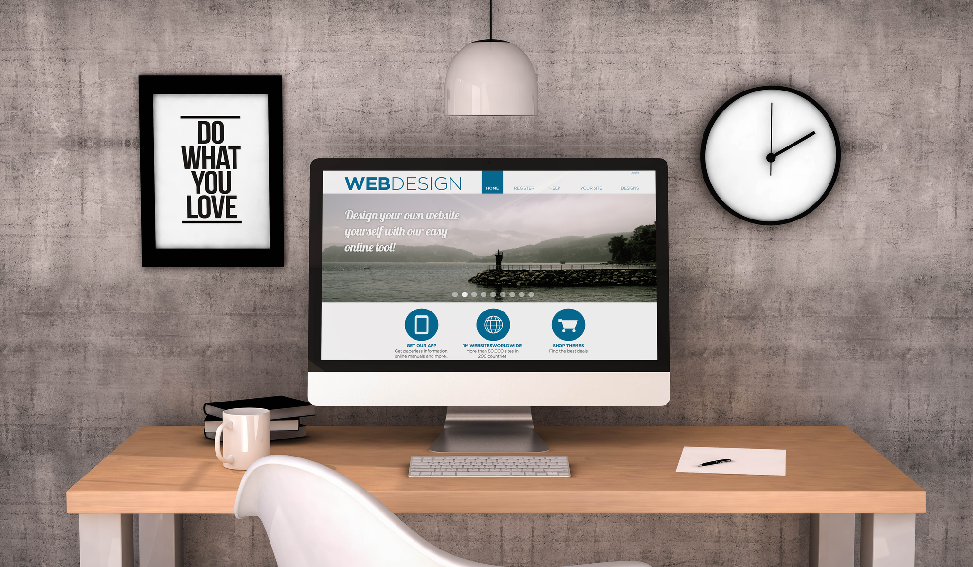
You have decided you are ready to create a website. Congratulations. During my journey, I came across people who believed that designing a website is a simple process of creating a few elements and moving them around. unfortunately, it is not the case. Yes, it is very possible for anyone to create a website these days and there are many great tools such as WordPress and Wix that makes it much easier. However, creating a high-quality website which fits the strict standards and guidelines of the web industry can be challenging and requires a lot of practice. If you wish to maximize your online marketing potential, it is not enough to have a “standard” website. To outperform our competition, our website needs to stand out in its content and design, be responsive (fit any device and screen size) and efficient. In addition, we need to make sure it is search engine optimized. Search engines have very strict requirements when it comes to website’s evaluation, and best practice will be to have those in mind at a preliminary stage of the development process and work accordingly. In the next few lines, I’ll try to explain a little bit about my process of creating a website, give a few tips of what to pay close attention to, and discuss pricing.
Step 1 – Definition and expectations
In the first step we need to decide what we are trying to achieve with our website. Do we want to ‘level up’ our brand and portray a more upscale business image? Generate more revenue? Expand our client base? Create an e-commerce platform that will help us to increase sale of goods? According to that we need to decide what will be the structure of our website. Should it be a full website? A landing page? How many pages do we want? What will be the sections (about, image gallery, contact, services etc.)? What functionalities do we want it to include? (the ability to purchase products, different options for potential clients to contact us, a personal area and more). At this point it is highly recommended to draw a paper or a diagram which will include all the desired pages, sections and sub sections.
Step 2 – Designing the website
At this step we will have rough draft of the website’s design. This will include ‘mix and match’ of the logo, text fonts, colors (that fit the clients personal taste and brand), pictures and more. The idea is to translate our thoughts into a rough draft and start shaping them by creating a visual design for our website. The client will get image files of the draft, and once satisfied we can proceed to the next step.
Step 3 – Form a final cut, not including the content
At this point we will have the desktop version of our website ready. The website will include demo content (Lorem Ipsum), but will have the final graphic design including logo, pictures, header, footer, heading etc.

Step 4 – inserting content and creating responsiveness
At this stage, we will insert all the relevant content into the right places. It might be a good idea to get the help of a professional web contenr creator. Personally, I like to work on the responsiveness once I’ve completed this step. Responsiveness is one of the most important aspects of a website and essentially it means that we need to make sure our website looks good in any screen width and or/size. A few examples are: a desktop computer, different sized laptops, iPad, tablet and mobile phone. It is essential for a website to look good when viewed in any type of device. For that reason, this part will most likely require use of custom coding (CSS), even if we built our website using a ‘non-coding’ platform such as WordPress or Wix. The reason is that although those platforms do a fairly good job in positioning the content and fit it to different screen sizes, they still have limited capabilities and many times will generate an uneven and ‘unaesthetic’ look and alignment in smaller sized screens. Coding in CSS gives us the ability to have a full control of the website’s appearance in any screen width thanks to a function called ‘media queries.’ You need to pay a special attention to tablet and mobile phone appearance, since those are the most common devices consumers use other than laptops and desktop computers.
Step 5 – Final touch ups and revisions
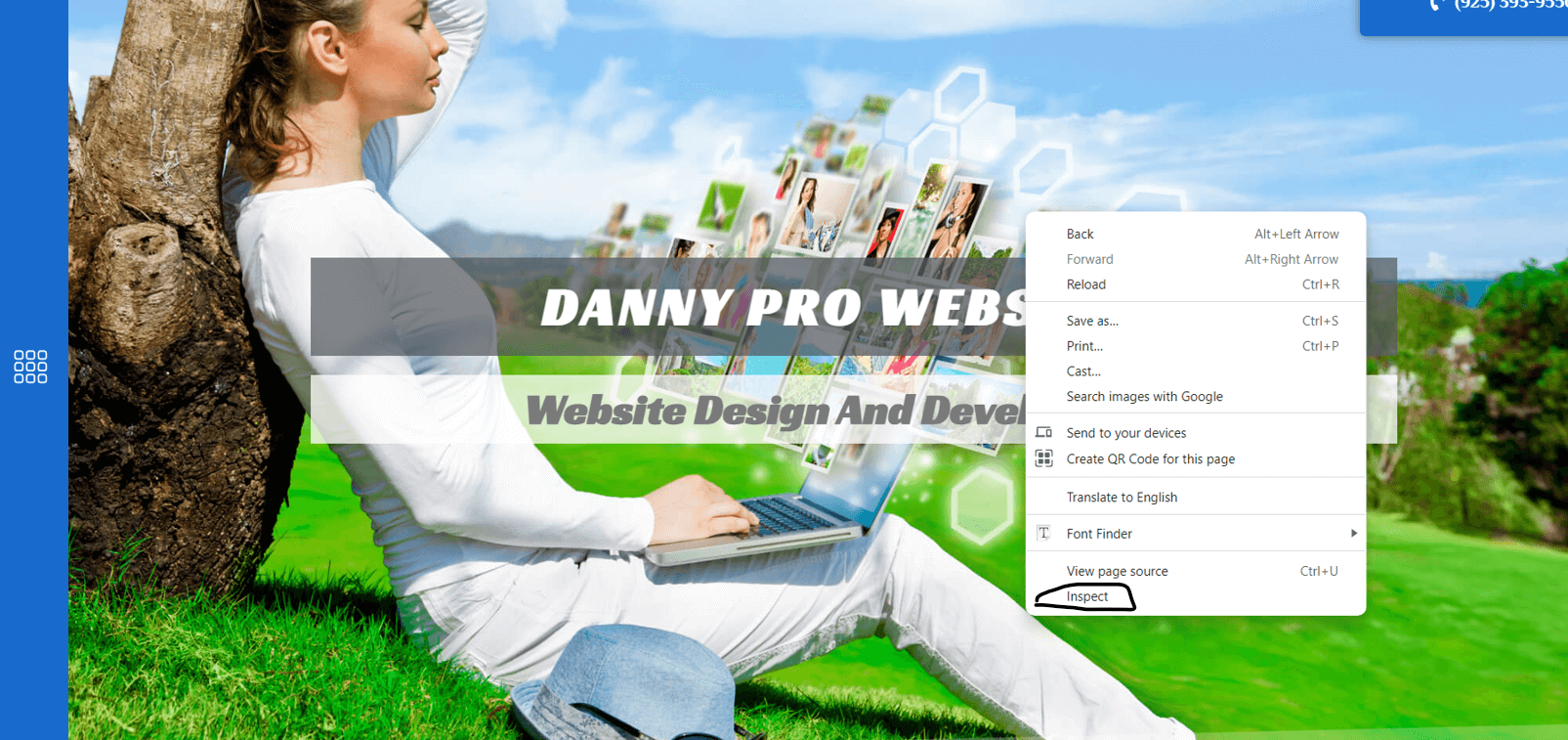
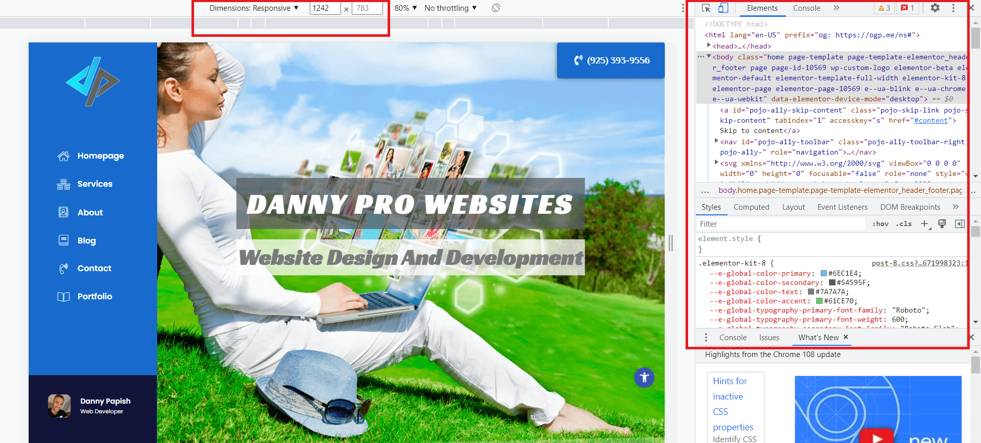
Once we are done with step 4, we’ll go over the website one more time and make sure it looks clean and neat, all the links work properly (especially the contact methods – contact form, phone links, social media, emails etc.), and verify one last time that the website is responsive and looks good in any screen width (To do that, simply hover with the mouse on any part of the website, click the right mouse key and choose ‘Inspect’. It will open a very useful tool called ‘Developer Tools’ which will give you the ability to test your website in different browser pixel widths and heights). When this is done – Congratulations we have a live website.
Pricing
My pricing is very affordable and varies according to the client’s needs. The price mostly depends on the extent of the website. Are you interested in a single page, or a full website with many different pages and sections? would you like to add a functionality which will allow customers to make transactions? Do you want to store information such as client’s details or track inventory? Would you like to create a marketing strategy? Would you be needing a regular maintenance? All of the above and more will affect the price. contact me and tell me about your goals and vision!
MORE FROM BLOG

Website Security: Safeguarding WordPress Sites from Emerging Threats
In today’s digital landscape, where websites are crucial for business operations, personal blogs, and online transactions...

What is CDN and what are the benefits of using it
When you get a visitor on your website, the technical process that occurs is that data is sent from your web server to the visitor’s...

Content Marketing and writing a blog – doing it right
The content is often referred as “the king of the web.” Content marketing is a sub-category of SEO (Search Engine Optimization), but in practicality it...

Ecommerce made easy – Everything you need to know
E-Commerce has been around since the early 90’s with Amazon being the pioneer, the concept gained an extreme traction during the recent years and today...

Uncover the Powerful Benefits of Fixing a Slow Website and Boosting Performance
Search engines utilize advanced algorithms to assess website performance. These algorithms test a large amount of parameters, each of which deserve it’s on article. Here,...

6 Powerful Reasons Why Not Having a Website is Hurting Your Business (and How to Fix It)
You have decided you are ready to create a website. Congratulations. During my journey, I came across people who believed that designing a website is...

Digital Marketing Secrets: – How to Crush Your Competition and Dominate Online
Digital marketing involves promoting your business through online channels such as search engines, websites, social media platforms, and mobile apps...
Website Security: Safeguarding WordPress Sites from Emerging Threats
In today’s digital landscape, where websites are crucial for business operations, personal blogs, and online transactions...
What is CDN and what are the benefits of using it
When you get a visitor on your website, the technical process that occurs is that data is sent from your web server to the visitor’s...
Content Marketing and writing a blog – doing it right
The content is often referred as “the king of the web.” Content marketing is a sub-category of SEO (Search Engine Optimization), but in practicality it...
Ecommerce made easy – Everything you need to know
E-Commerce has been around since the early 90’s with Amazon being the pioneer, the concept gained an extreme traction during the recent years and today...
Uncover the Powerful Benefits of Fixing a Slow Website and Boosting Performance
Search engines utilize advanced algorithms to assess website performance. These algorithms test a large amount of parameters, each of which deserve it’s on article. Here,...
6 Powerful Reasons Why Not Having a Website is Hurting Your Business (and How to Fix It)
You have decided you are ready to create a website. Congratulations. During my journey, I came across people who believed that designing a website is...
Digital Marketing Secrets: – How to Crush Your Competition and Dominate Online
Digital marketing involves promoting your business through online channels such as search engines, websites, social media platforms, and mobile apps...